Data & Visuals
I’ve spent a good part of my career trying to make information easier to understand. Sometimes that means a dashboard. Sometimes it’s a chart, infographic, or a single visual that makes the important thing obvious.
The tools may vary, but the goal is usually the same: make the information useful.
Exploring Income Across Countries and Time
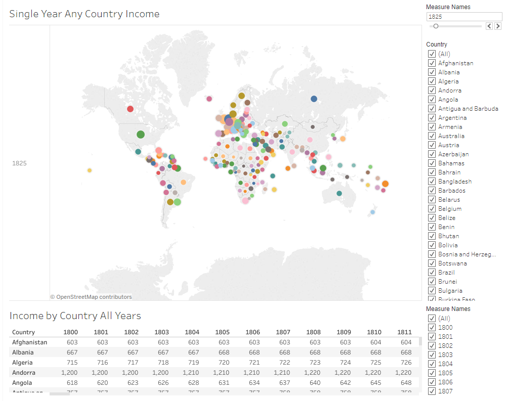
An interactive visualization exploring historical income by country and year. Users can select countries and years to examine how income changed across geography and over time.
Tableau
Personal Finance Dashboard
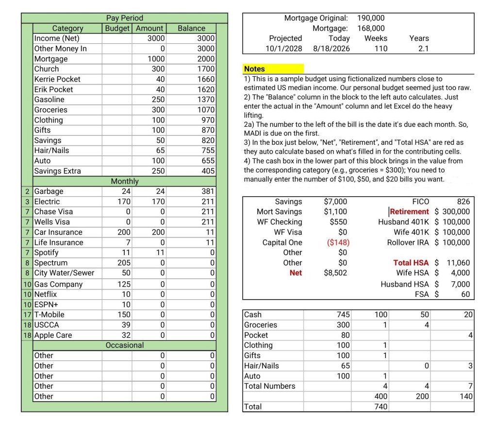
I originally built this Excel dashboard for a practical reason: to manage our household finances. I’ve used and refined versions of it for years to manage spending, savings, retirement accounts, mortgage progress, cash needs, and other financial information in one place. This version uses fictionalized data rather than our actual finances.
Excel
Making Information Easier to Understand
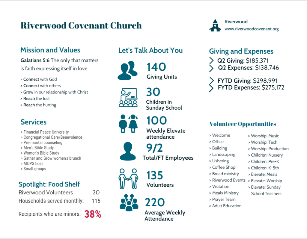
This infographic was designed to bring a lot of different information into one understandable picture. Financial results, attendance, participation, staffing, volunteer opportunities, and ministry activities all matter, but presenting them as separate numbers makes it harder to see the whole. The goal was to make the information approachable without oversimplifying it.
Visme
Showing Relationships, Not Just Numbers
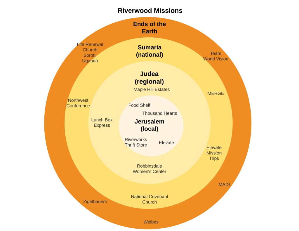
Not every visualization starts with numbers. This graphic was created to show how Riverwood’s mission efforts extended outward from the local community to regional, national, and international ministries. The concentric circles make those relationships easier to understand than a simple list of organizations could.
Visme
Turning Information Into Action
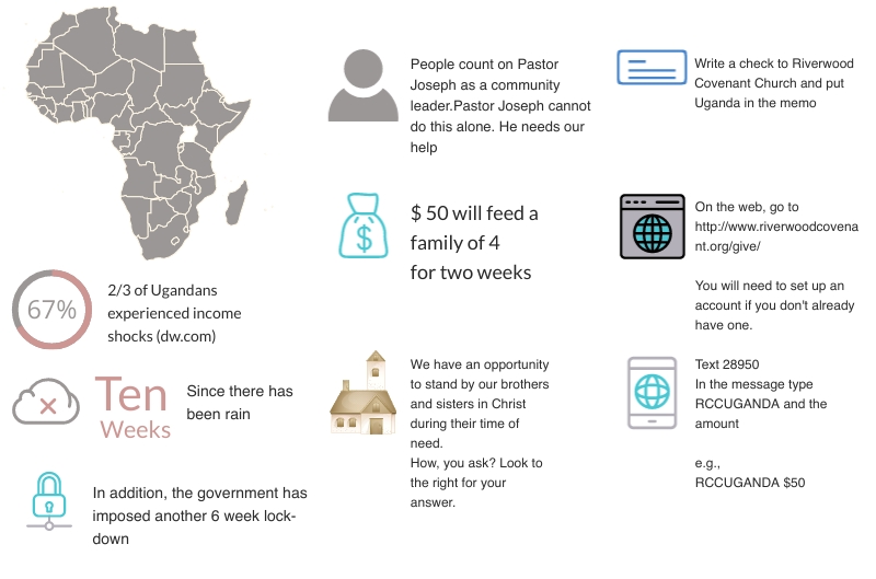
Sometimes the purpose of a visual isn’t simply to inform. This infographic combined information about conditions in Uganda with specific ways people could help. The challenge was to communicate the need, provide enough context to make it meaningful, and make it clear how someone could help without overwhelming the reader.
Visme
Much of the data visualization work I’ve created professionally was developed for clients and belongs to them, so it isn’t included here. The examples above are work I can share publicly and represent some of the different ways I’ve used data and visuals to make information more understandable and useful.

