Below are some examples of my work. Finding decent examples to share can be challenging. Most of the work I do or have done is as a consultant or a company employee. As such, the people for whom I created the work own it and it’s not mine to share. However, I have some examples here that I created for me, and some that I have permission to share.
I am relatively new to creating Infographics. Many of which I can share. Even though I have limited experience, I have used a variety of tools to communicate information using visualizations: LucidChart, Visme, Piktochart, Tableau, Excel, and others. It’s a great big visualization world out there and I encourage you to explore creating your own visualizations, infographics, or whatever you want to call them.

A graphic sharing highlights on how to help our sister church in Uganda during the 2021 drought 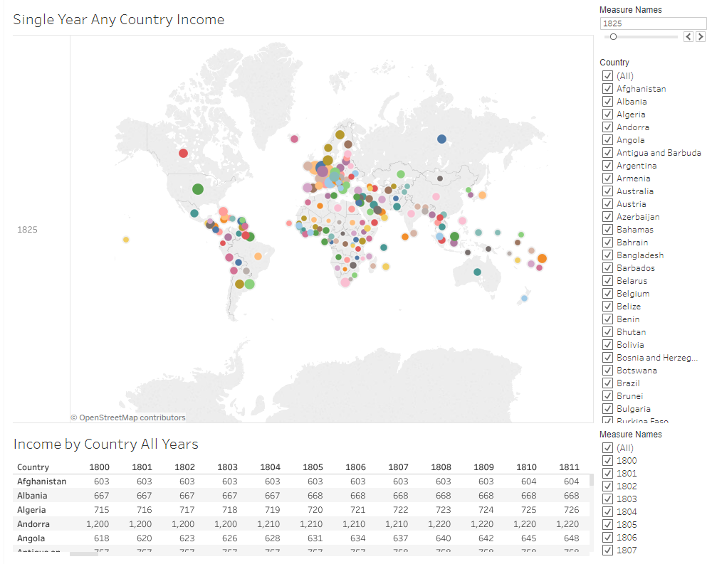
Income by Country and Year allowing to filter on both country and year 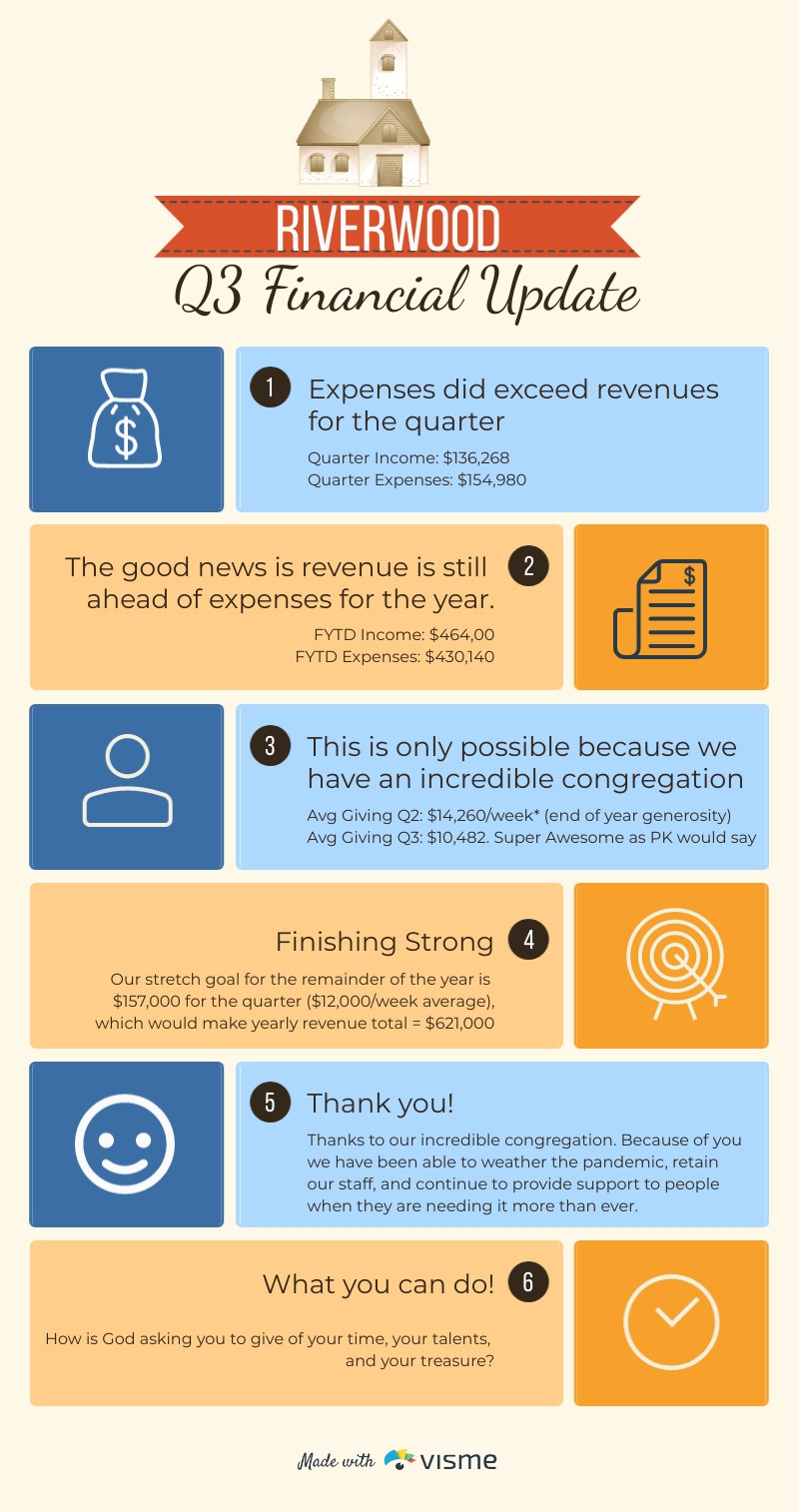
Riverwood Quarterly Financial Infographic 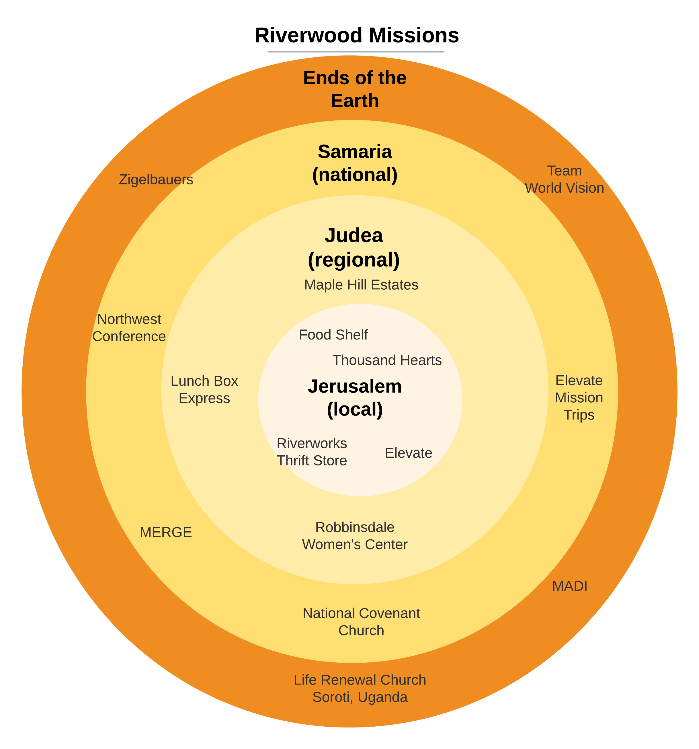
Missions that our church support, by area 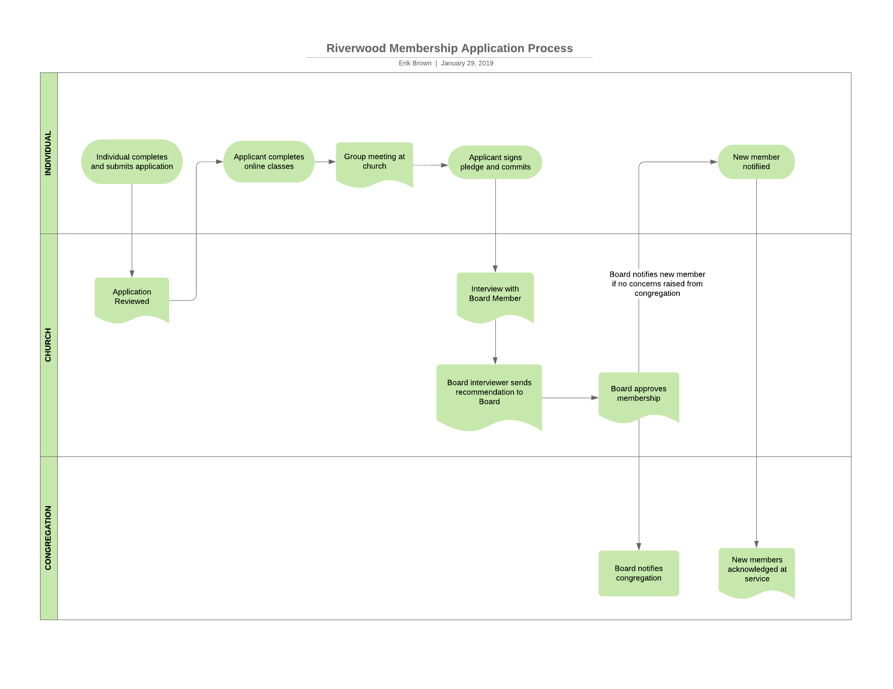
Becoming a member process flow with Lucidchart 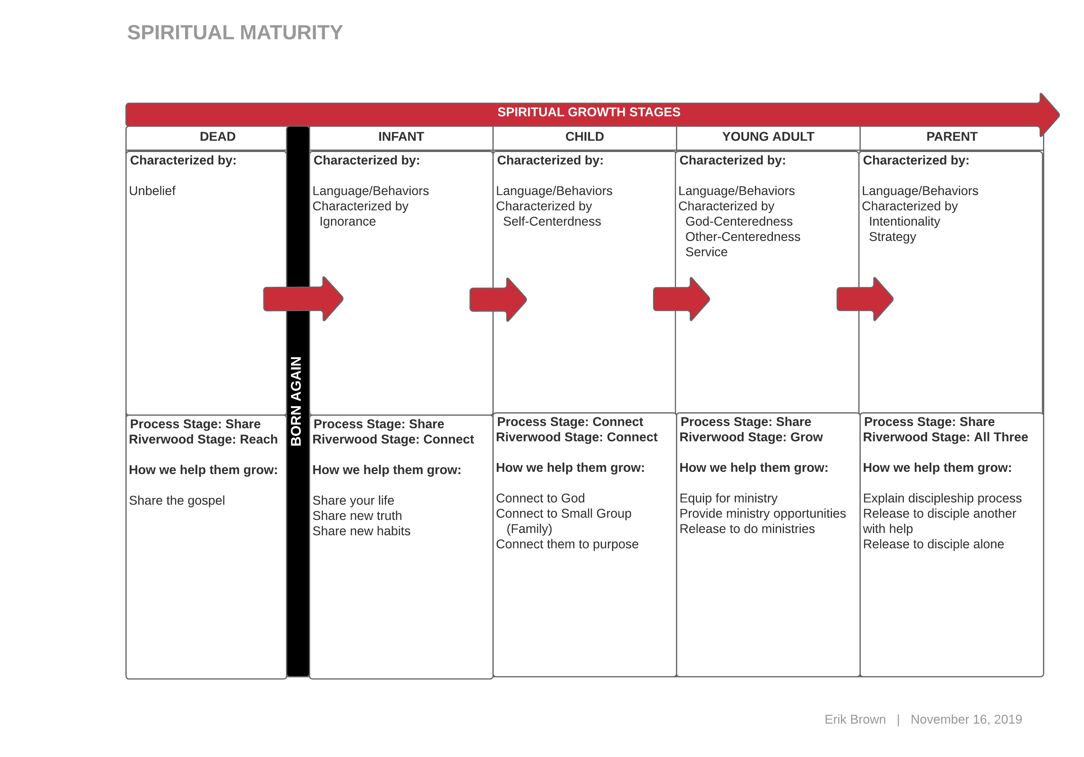
My interpretation of Spiritual Growth Stages from book: Real Life Discipleship. I didn’t like their graphic 
For my MBA I created a budget flow using a tool called Simile. 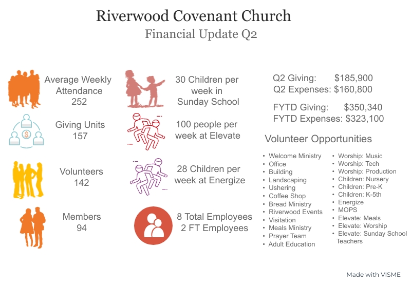
Riverwood Quarterly Financial Infographic 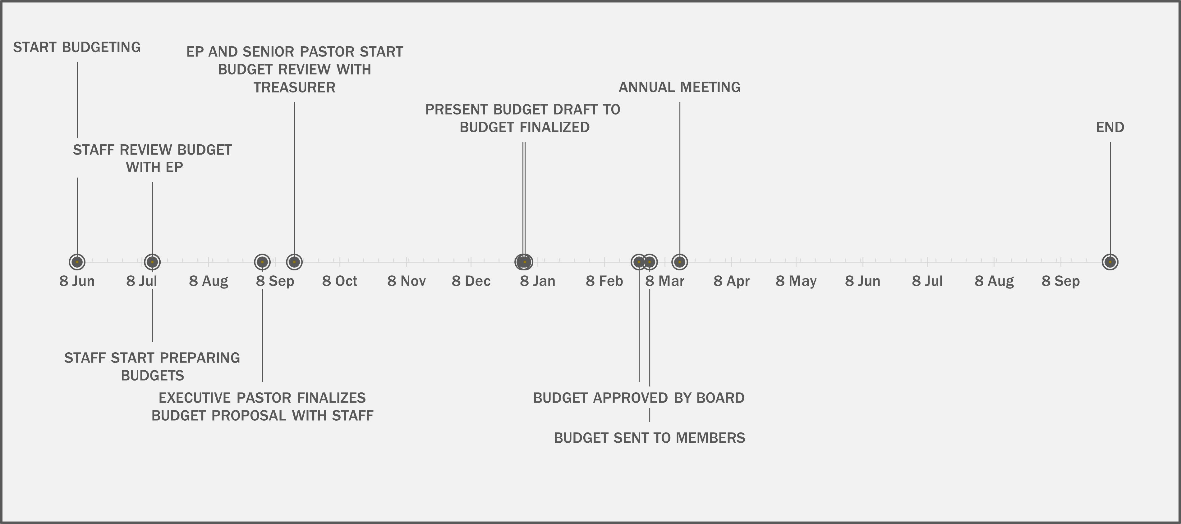
Not everything has to be fancy. This is a simple timeline using Excel 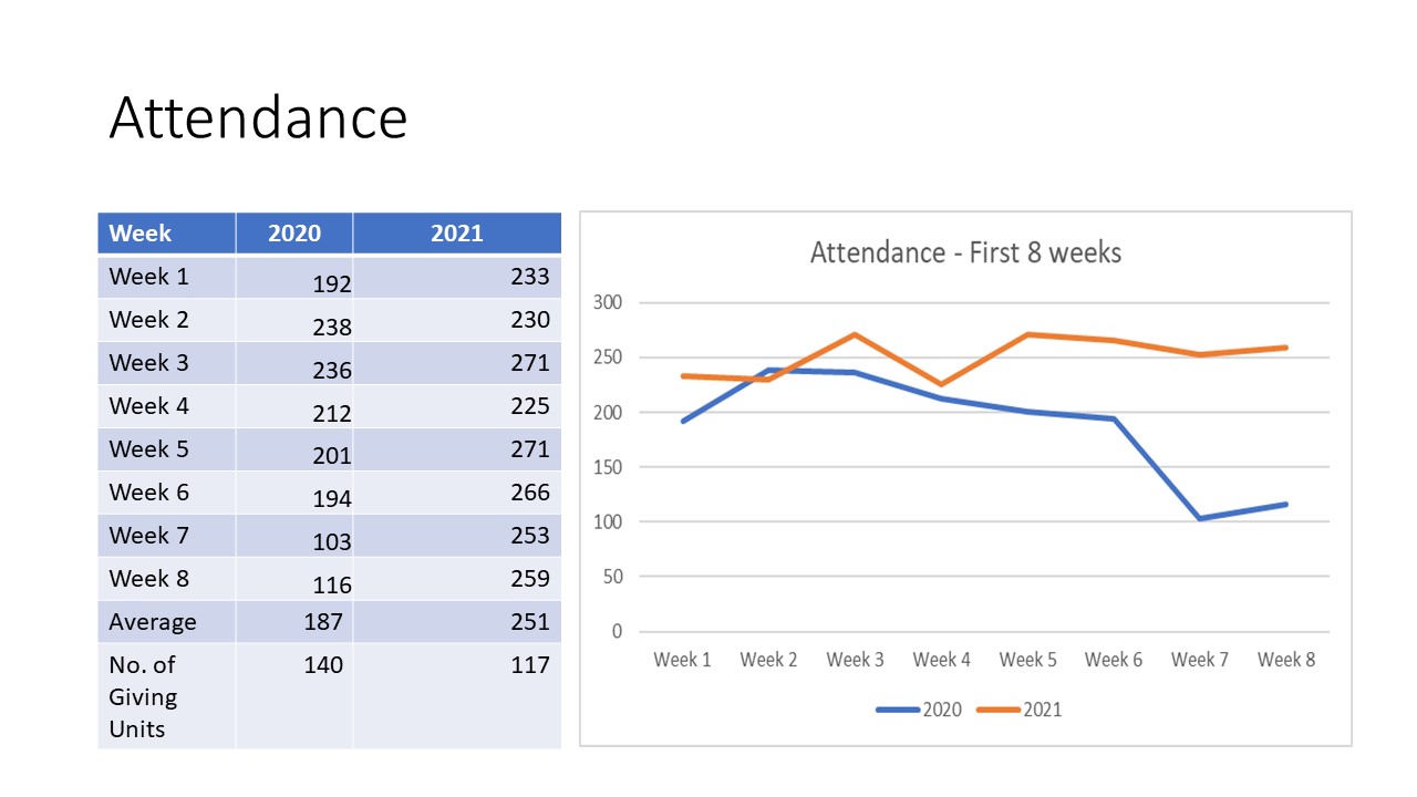
Another simple graphic, in PowerPoint, comparing attendance over 2 years
The work I find most interesting and rewarding is work that helps make someone’s life better, or at least a little less cumbersome. There are some examples above. Some more examples for which I can only share the narrative here:
- A visual I redid and simplified to make it easier to follow a narrative
- Consolidating six separate reports that a user had to actively pull individually from a server into a one-page dashboard automatically delivered to an email distribution list every morning
- Creating an exception report to highlight data outside expected norms reducing triage time for my client from 3 hours every day down to 15 minutes.
- Or a one-page display providing all the necessary information to guide decisions in one place.
